Everything Daitoo can do — write a list, fill it with lines, tick them off, and let each list decide what happens next.
Daitoo is free to use, and paid to configure. Writing lists and items, ticking them off, the emoji, the phrases it remembers and sharing a list with somebody are all free, and so are your first five lists. Three things need a subscription — Daitoo Pro: what a list is configured to do, reading a photo onto a list, and keeping more than five lists. Each of them is marked where it comes up, and there is a section on it at the end. Daitoo also works entirely offline — the only things that need a network are picking an emoji for wording your device has never written, reading a list off a photo, and syncing a list you have shared.
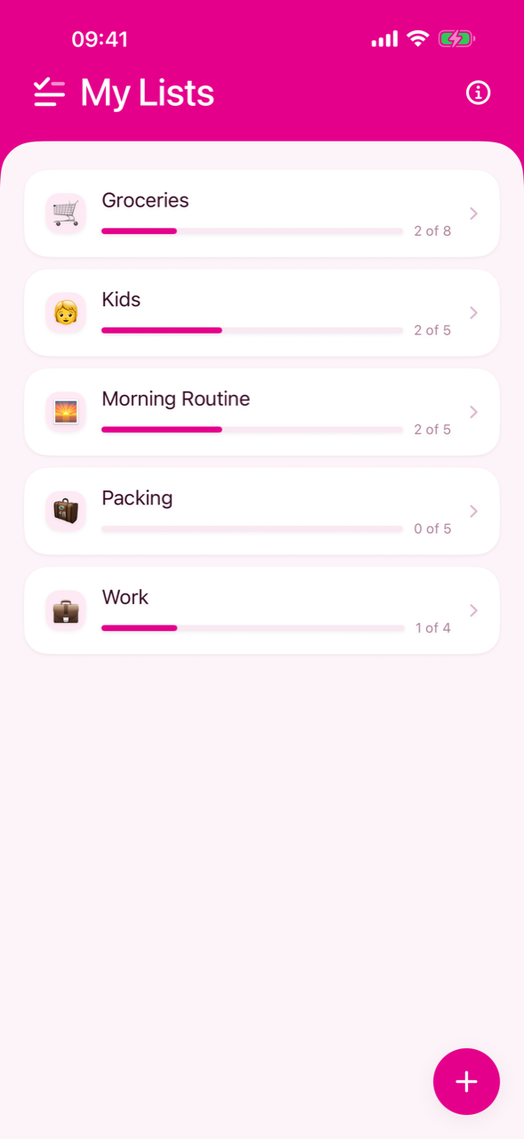
Opening the app lands you on My Lists — every list you keep, each with its own emoji, the number of items it holds and how far through it you are.
Pulling the overview down refreshes the lists you share with someone. If you share nothing, there is nothing to fetch and the gesture is not offered — a spinner that turns over nothing is worse than no spinner at all.
Five lists are free, and the sixth is where Daitoo asks. The offer appears at the + button rather than after you have filled the form in, so nobody names a list that was never going to be accepted.
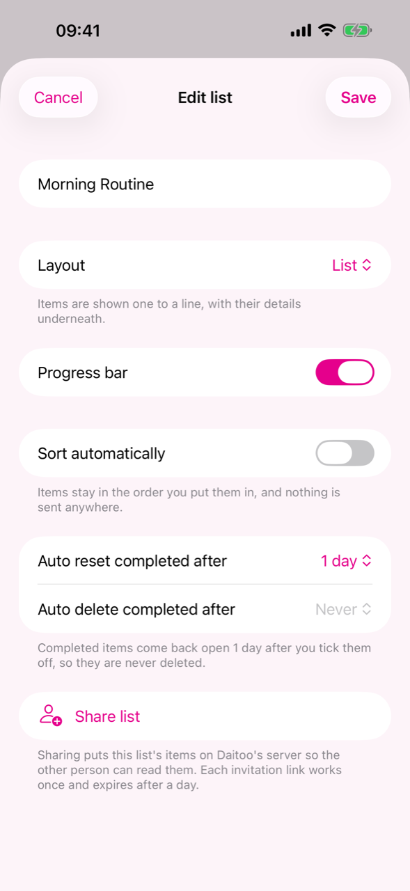
The + button opens a form that asks for a name and then for the two things a list decides for itself. The same form is what Edit opens later, so nothing here is frozen at creation.
Both windows start switched off, so a brand-new list does nothing behind your back until you ask it to. A blank name cancels the whole form, windows included — a half-applied form is a worse answer than none.
Everything under the name is Daitoo Pro. The controls stay live whether or not you subscribe — nothing is greyed out, because you should be able to see what you are being asked to pay for — and the offer appears when you save. Buying it finishes the save you were making. The name is not one of them, so renaming a list never costs anything.
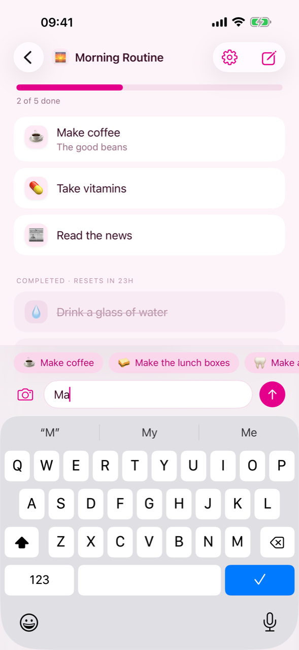
Items are written in the bar at the bottom of a list — a field to type in, a send button beside it, and a camera on the other side. Type a line and tap send, or just press return; the focus stays put so you can type several in a row, and the list scrolls down to whatever you just wrote.
As you type, Daitoo offers back phrases you have written before, the ones you use most first. Tapping one writes that item immediately rather than filling the field in — filling it in would cost you the same two gestures as typing the thing out, and then autocomplete would be a convenience rather than the point.
The phrases it remembers belong to you, not to a list, so a line you first wrote on the groceries is offered again on the holiday packing list. Items that arrive on a shared list are learned too, which is why a phrase your partner added is there waiting the next time you write it.
The camera on the left of the composer reads items off a photograph. It is for the two things nobody wants to type twice: a recipe, and a list somebody wrote on paper.
What comes back is named the way a person would write it, not transcribed: `200 g plain flour, sifted` becomes Flour, and the quantities, the weights, the method and anything else that is not an item do not come back at all. The items arrive in your language whatever language the photo is in, because they are about to be matched against your own history.
This is the one thing in Daitoo that sends more than wording — a photograph carries a place, a date and whatever else was in the frame, none of which anybody typed. The picture is in memory for a single request and then gone; it is stored nowhere, at either end, and nothing is retried in the background. A scan that failed is a scan you take again.
Reading a photo is Daitoo Pro, and it is the one thing in the app whose cost grows with use: a model has to look at the picture, and no two people photograph the same page. The offer appears when you tap the camera, before a photo is taken and before anything is sent.
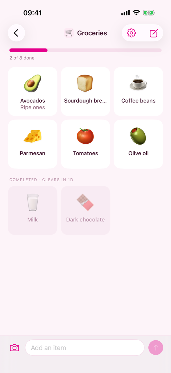
Ticking off is the thing people do most, so it costs the cheapest gesture there is: tap an item. Tap it again to put it back. Completed items sink to the bottom, greyed out and struck through, under a header that says what will happen to them next.
| Gesture | What it does |
|---|---|
| Tap | Tick the item off, or put it back |
| Swipe right | Edit the item — its wording and its note |
| Swipe left | Delete the item |
| Press and hold | Pick the item up and drag it somewhere else |
| Pull the list down | Sync now, if the list is shared |
One action per edge is deliberate: when the two shared an edge, the destructive one sat a thumb's width from the harmless one, and a swipe that went slightly wrong revealed the wrong button.
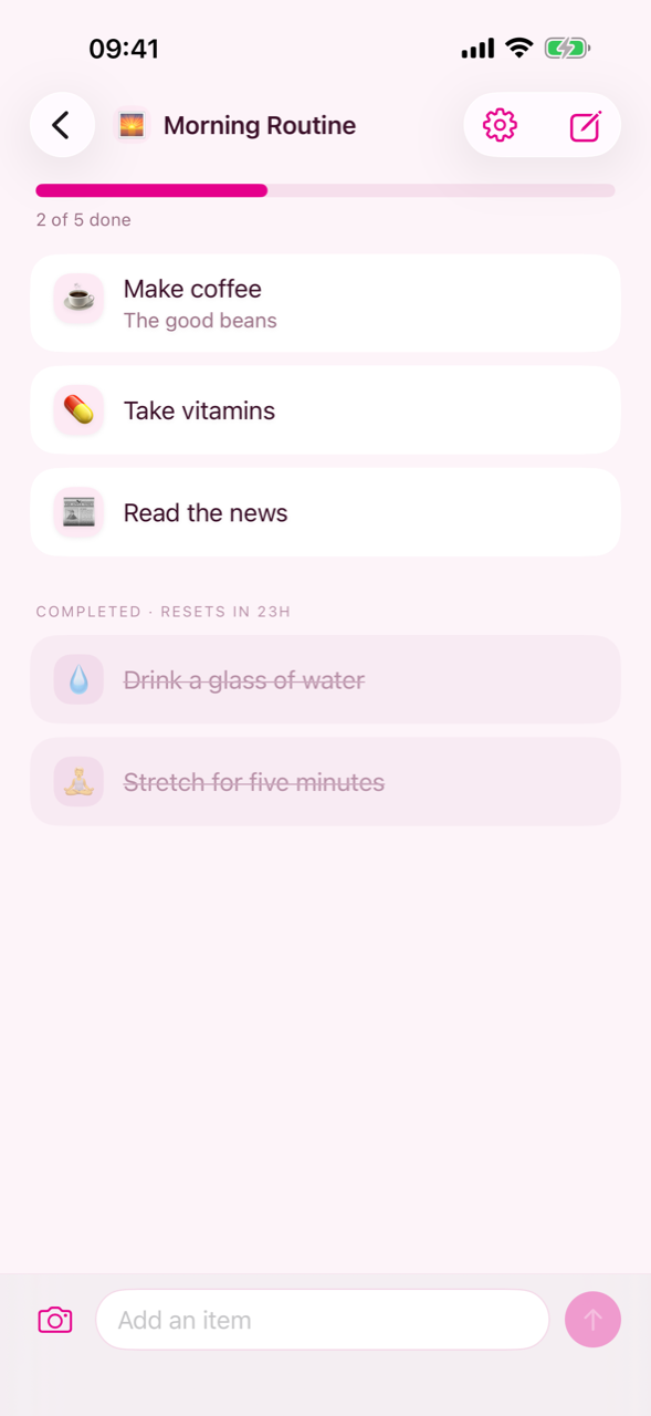
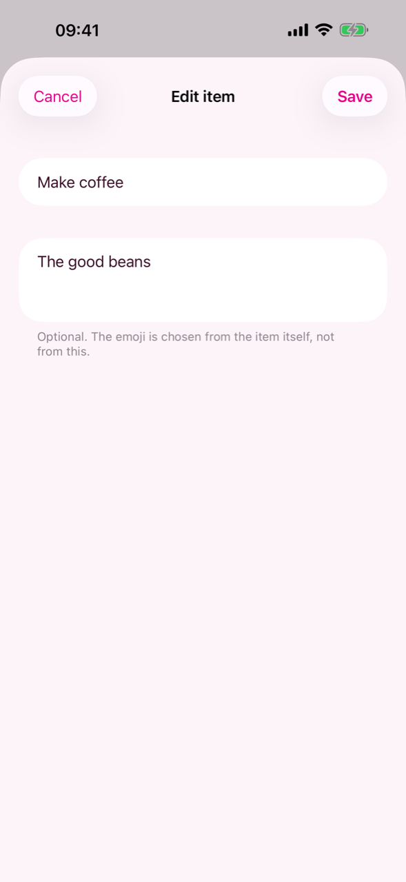
An item is one line — what it is about — plus, optionally, details: anything more that did not belong on that line. The note shows under the title in smaller muted type and is never struck through, because the strike is what says "done", and saying it twice in one row does not say it any louder.
Details are written in the edit form, which the right swipe opens, and nowhere else. The composer stays one field on purpose: a second box to tab past would cost you effortlessness on every item to serve the few that want a note.
A blank title is refused, and it cancels the whole edit rather than half of it. Writing or clearing a note is not new wording, so it asks for no new emoji; changing the title does, and the item goes back to its pulsing dot until the answer arrives.
Whether a list comes back is the list's own decision, not the app's. Each list keeps two windows, both able to be off, and you set them in the same settings form you named the list in.
The two never both apply: a list that resets never deletes. "Whichever deadline passes first" sounds obviously right and is not — the check only runs when a screen opens, so it really means "whichever one you happened to be looking at". The form greys the delete window out while reset is on, rather than showing a setting that does nothing.
The header above the completed items names the window that will actually fire — COMPLETED · RESETS IN 19H, or · CLEARS IN 5D — and says nothing at all when both are off.
Both windows are Daitoo Pro. Setting or changing them is one of the things the subscription pays for; a window you have already set keeps firing whether or not the subscription is still running.
Beside the list's settings button sits a second control with exactly three actions. What the gear is to the list, this is to the items on it.
Completing and resetting are each other's undo, so they happen immediately; emptying asks first, because nothing on screen puts that back. An action with nothing to act on is greyed out rather than dropped, so the items never move under your thumb.
These read what is stored rather than what is on screen, so an item that was already ticked off keeps the moment it was ticked off at. On a shared list that means only the items that actually moved are sent to the other person.
A list is drawn one of two ways and the list decides which, in the same settings form as the two windows. List shows items one to a line with their details underneath. Grid shows them three to a row, as big emoji with the title and its note on the lines below.
A grid gives up one thing and the sentence under the picker says so: dragging to reorder stays a list gesture. The order itself is untouched, and switching back makes it rearrangeable again. What a tile keeps is the tap, which completes as it does everywhere; edit and delete move under the press, which a tile has spare because nothing is dragging it.
Like every other list setting, the layout travels with a shared list: two people on one list are meant to be looking at the same list, rather than at two that happen to share their items.
The layout, the progress bar and automatic sorting are Daitoo Pro, like the two windows — they are what a list is configured to do, and that is the half of the app the subscription pays for.
Two more things a list decides for itself, in the same settings form as the layout and the two windows — and part of Daitoo Pro like them.
Sorting is the one list setting that sends something. With it on, the items are sent to Daitoo's server to be put in order each time you add one — they are not stored there — and you can no longer drag items into an order of your own, because the list is choosing it. The sentence under the switch says so before you turn it on.
A list can be shared with another person, and then you both add, complete and delete on the same list. Sharing is reached from the list's settings form.
An invitation link works once and expires after a day, so sharing with two people means tapping Share twice. Deleting a shared list means leaving it: it goes from your devices, the others keep it, and the last member out takes the list with them.
Sharing is the only thing in Daitoo that puts what you wrote on a server, and the form says so before you tap. A list nobody shares never leaves your own devices.
Sharing costs nothing, and neither of you needs a subscription — not the person who sends the invitation, not the person who opens it. An invitation link is the one way Daitoo reaches anybody who does not already have it, and a paywall in front of that would be a paywall in front of a friend.
Every item and every list gets an emoji chosen automatically. You never pick one — there is no emoji picker in Daitoo at all — and the emoji is the only thing the AI does: no spelling correction, no rewriting. What you typed is what the item says, forever.
While an item waits, it shows a pulsing dot rather than a stand-in glyph: an invented answer reads worse than an honest wait. If the request could not go out — no signal, or the backend is down — the app tries again in the background, from once a second down to at most once a minute, and the item is completely usable in the meantime.
Daitoo is free to use, and paid to configure, to photograph into, or to fill past five lists. That is the whole of it, and it is the shape of the app rather than a pricing experiment: Daitoo is a handful of lines you tick off, and a paywall in front of that is a paywall in front of the app.
Everything else is free, and stays free:
There is no route to the offer that is not you being stopped: no Go Pro row in the settings, no badge on the overview. It appears when you save a list's settings, when you tap the camera, and when you add a sixth list — and nowhere else.
Daitoo Pro is a subscription, billed by the App Store or Google Play through the account you already have there. The price, and any trial the current offer includes, are shown in the app before you buy, in your own currency; there is no one-off or lifetime purchase at the moment. Cancel it in your store account and it runs to the end of the period you have paid for.
Nothing is taken away. Every list, item and note stays where it is, shared lists go on syncing, a grid stays a grid and a list that resets keeps resetting. What stops is changing those settings, reading a photo onto a list, and making a new list once you are over five.
Daitoo speaks English, German, Spanish and French, and it follows the language your phone is set to. On both platforms it can also be set to one of them on its own, without changing the whole phone — on Android under Settings › Apps › Daitoo › Language, and on iOS under Settings › Daitoo › Language.
If something is not working, the frequently asked questions cover the usual suspects — items stuck on their pulsing dot, a shared list that looks out of date, lists missing after a reinstall.
Anything else, write to support@daitoo.app or use the contact form on the home page. A bug report that says which phone, which platform and what you did before it went wrong is worth three that do not.
